Expert is a conceptual mobile-first web application enabling anyone, anywhere to connect with industry experts for help with everyday problems.
Project Overview
Problem
Users need a streamlined way of easily connecting with professionals from various fields of expertise because they often encounter problems they have little to no experience with.
Solution
Design a responsive web application that provides everyday users a way to directly connect with industry experts
Role
UI/UX Designer & Researcher
Tools
Figma, Sketch, Usability Hub, Google Forms, Optimal Card Sorting
Design Process
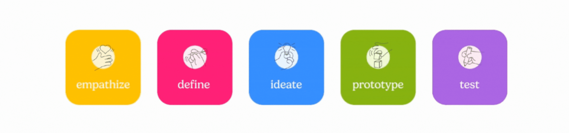
Empathize
Competitor Analysis
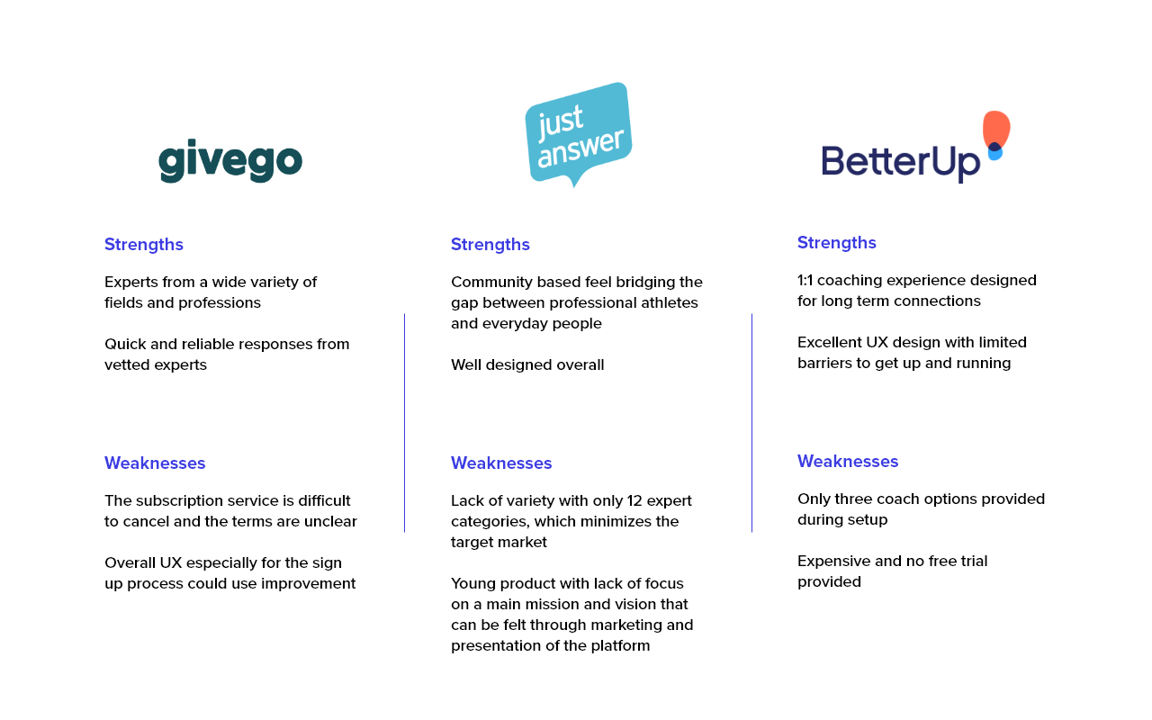
To kickstart the empathize phase of my design process, I conducted a competitor analyses to gain insight on user opinions on current solutions in the market. Expert's competitors will include Just Answer, BetterUp, and Givego; each of which offer varied coaching and expert connection experiences.
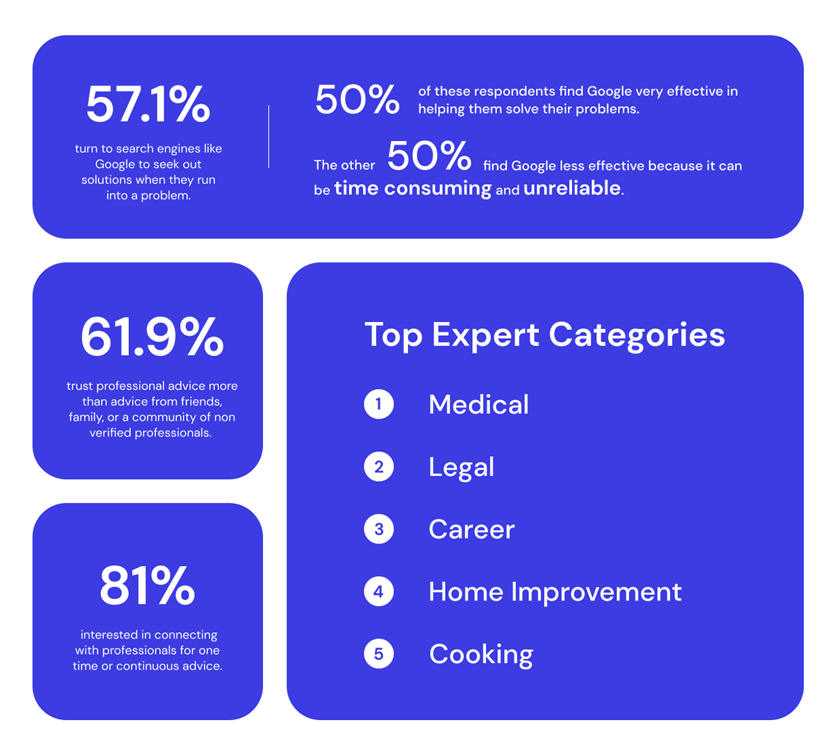
User Research
I conducted a user survey that generated 21 responses and three user interviews with target users ages 25 to 38 to collect data catered towards my research goals:
- Understand a user’s behavior when they face a problem that requires professional help or advice
- Identify what resources are most in demand for users to narrow down which categories of experts
to focus on and prioritize
- Identify pain points with current solutions in the market
Survey Insights
Define
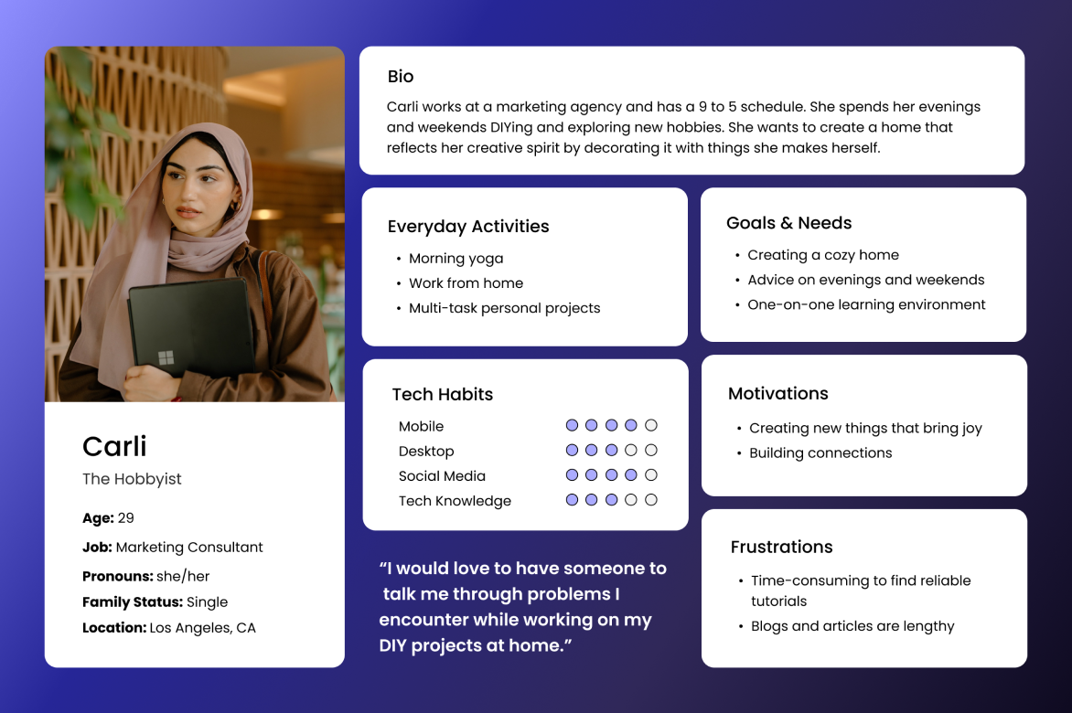
User Personas
After analyzing my research data, I compiled my insights into two primary user personas, Carli the Hobbyist and Jared the Entrepreneur.

User Flows
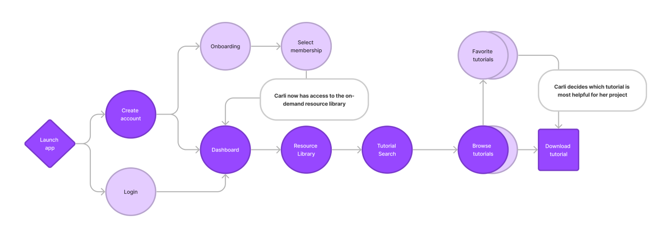
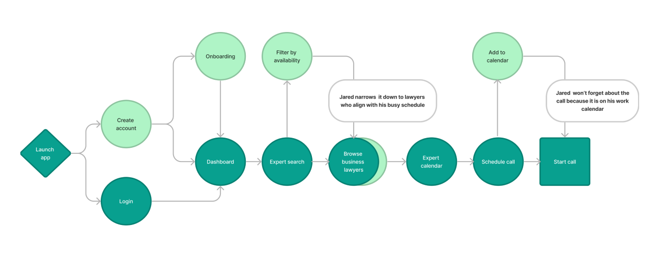
To better empathize with Carli and Jared, I created user flows for situations in which they would utilize Expert to meet their objectives.

Objective Scenario:
As a DIY enthusiast, Carli wants to find a furniture refurbishment tutorial from a verified expert, so that she can complete more projects around her house.

Objective Scenario:
As someone starting a new business, Jared wants to set a one-time meeting with a lawyer, so he can get help applying for his business license.
Ideate
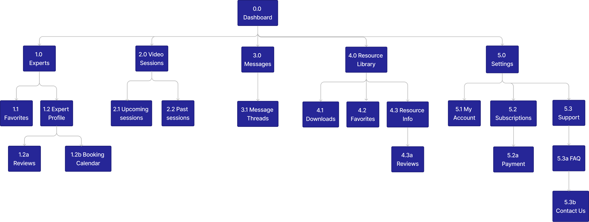
Sitemap
After mapping out user flows, I began planning the responsive web application’s information architecture and built out a sitemap.
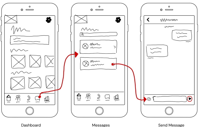
Low Fidelity Wireframes
Using my research, personas, and understanding of the application’s architecture, I began sketching out low-fidelity wireframes for both mobile and desktop based on key user flows.

Mid Fidelity Wireframes
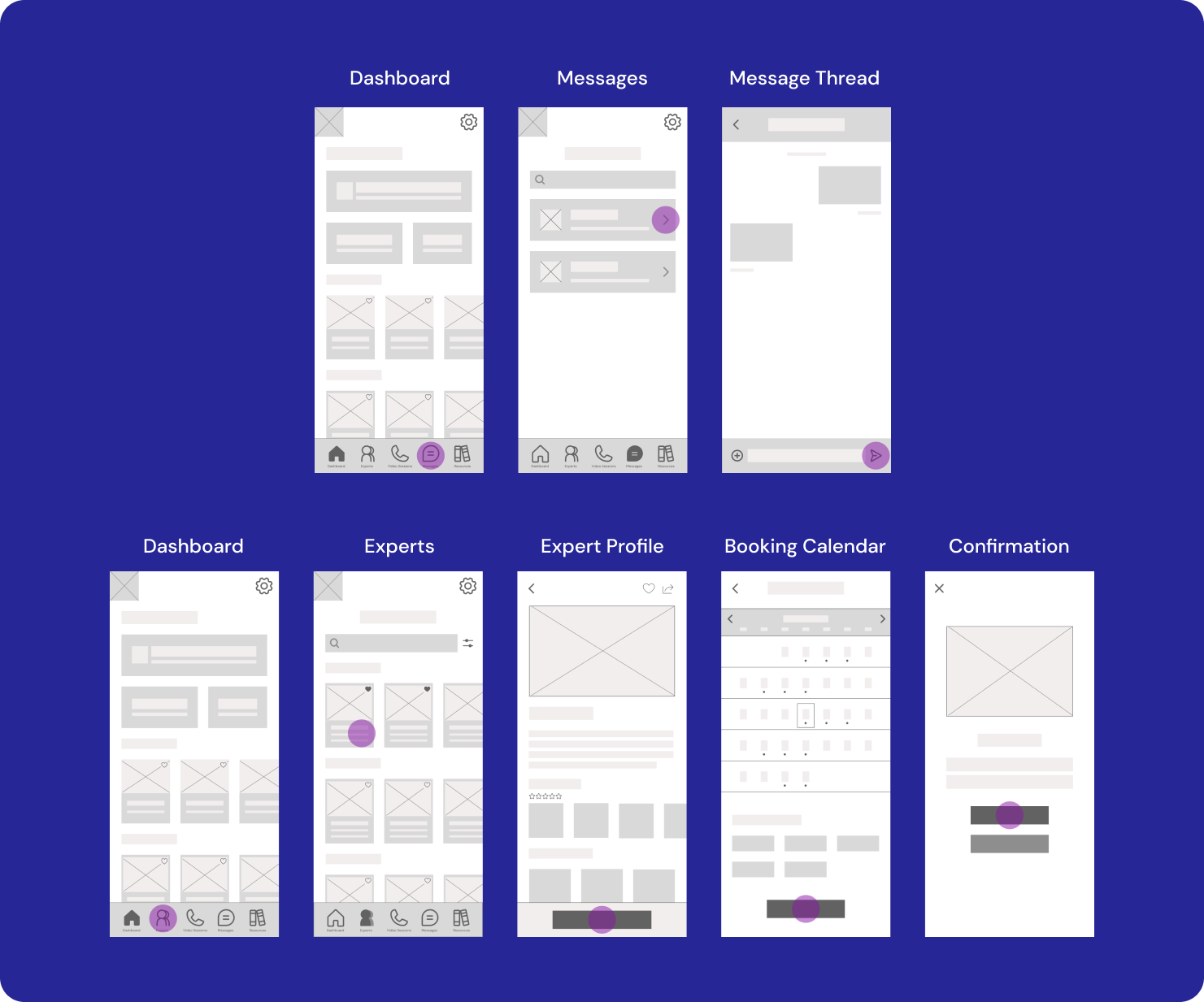
To visualize design decisions made in my low-fidelity sketches, I digitized my wireframes. This allowed for better understanding of how users would interact with the application while maintaining iterative capabilities.
Prototype
Mid-fidelity Prototype
By replacing placeholders on my wireframes with text and more details, I created an interactive prototype to utilize for user testing.
Test
Usability Test
To measure the usability of Expert’s overall design so far, I conducted a mixture of moderated in-person and moderated remote usability test sessions.
Results
After reviewing the data from each session, I identified five key issues that created confusion for multiple test participants. Based on their feedback, I made revisions to improve the overall usability of Expert's design.
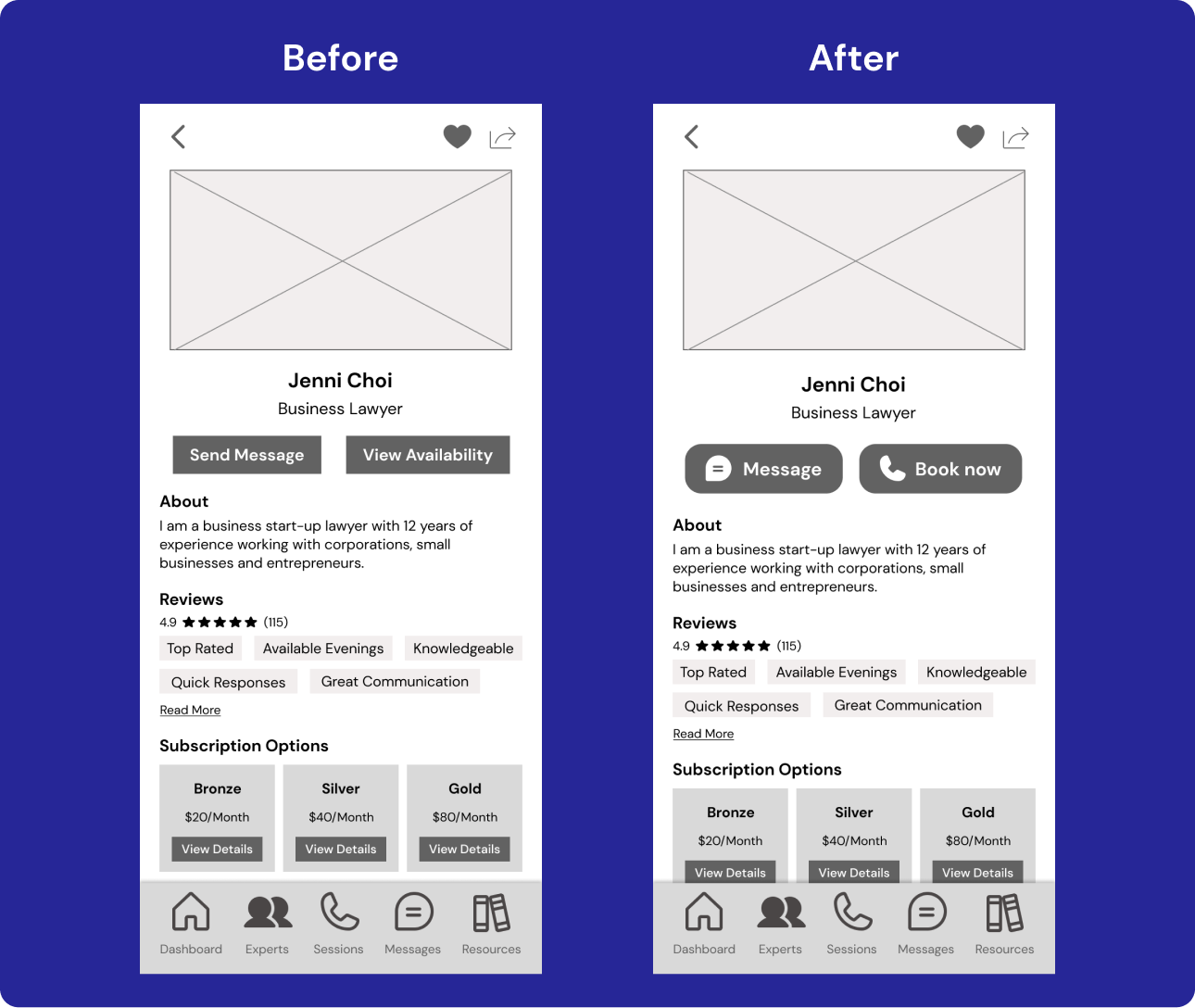
Key Issue #1:
67% of participants expressed difficulty recognizing ‘View availability’ as the button for booking a call
Solution:
Add a call icon and change copy to a phrase more universally recognizable
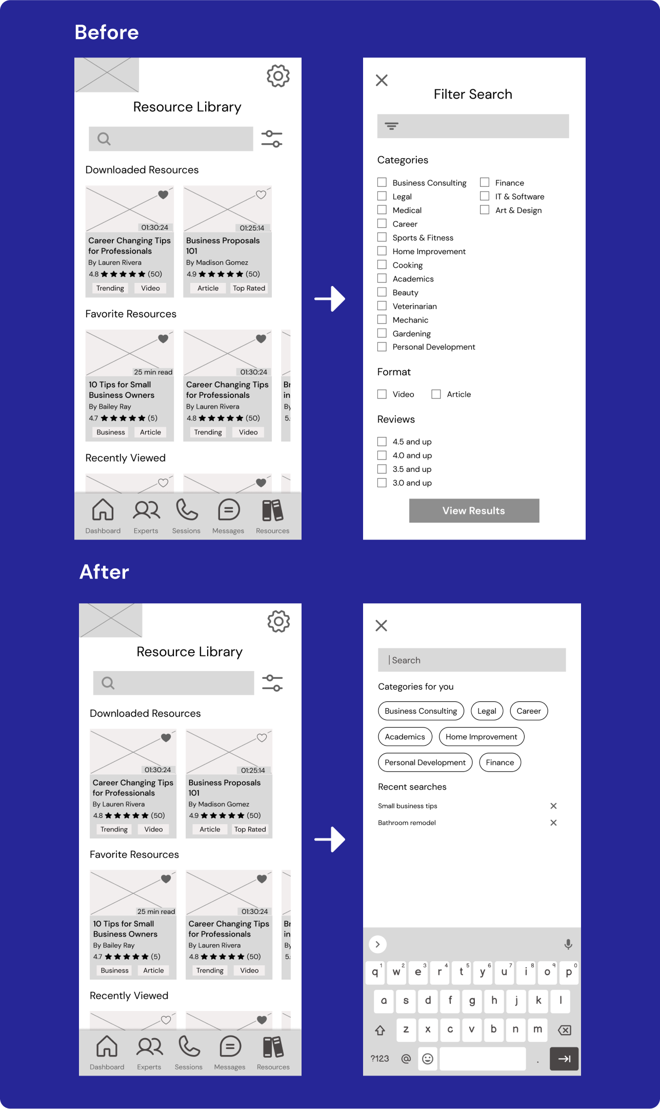
Key Issue #2:
50% of participants naturally clicked the search bar before filtering
Solution:
Adjust flow to prioritize selecting the search bar and incorporate filters on the search screen
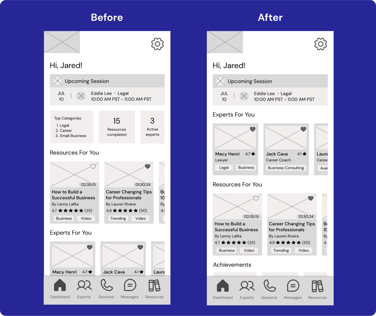
Key Issue #3:
50% of participants thought there was too much content on the Dashboard
Solution:
Rearrange hierarchy and incorporate more white space
Key Issue#4:
33% of participants were confused when trying to get out of pop-ups
Solution:
Add a timer to all pop ups
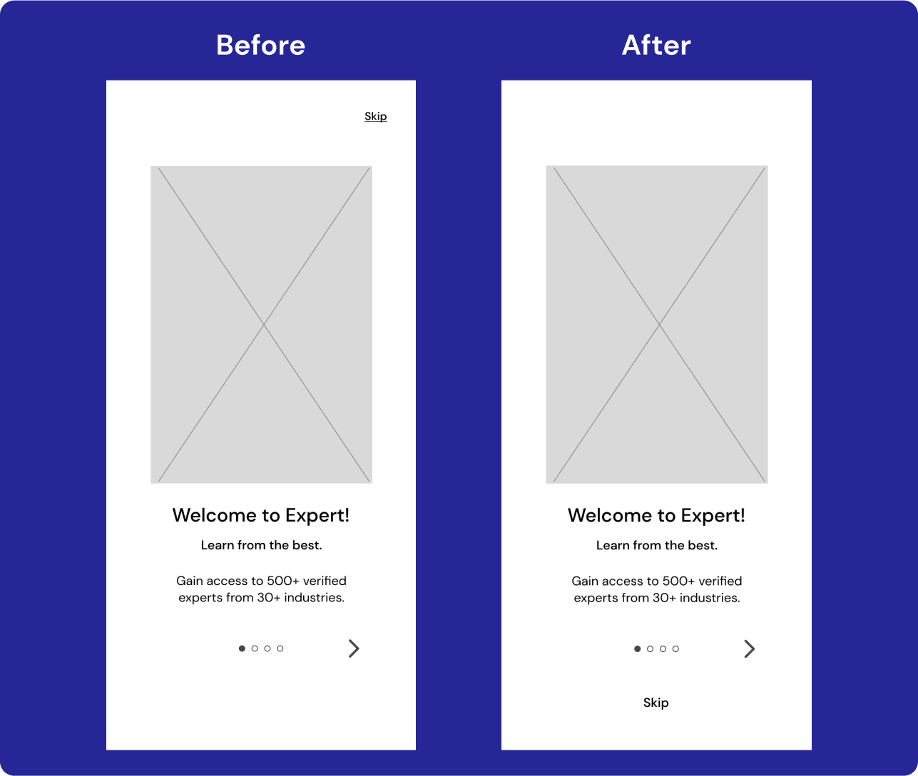
Key Issue #5:
‘Skip’ button was not apparent enough on the onboarding screens for 17% of participants
Solution:
Move button closer to progress indicator and enlarge font
Preference Test
As I began adding in more UI elements to my prototype, I conducted a preference test with two versions of Expert’s introduction screen with slightly different messaging and visual elements.
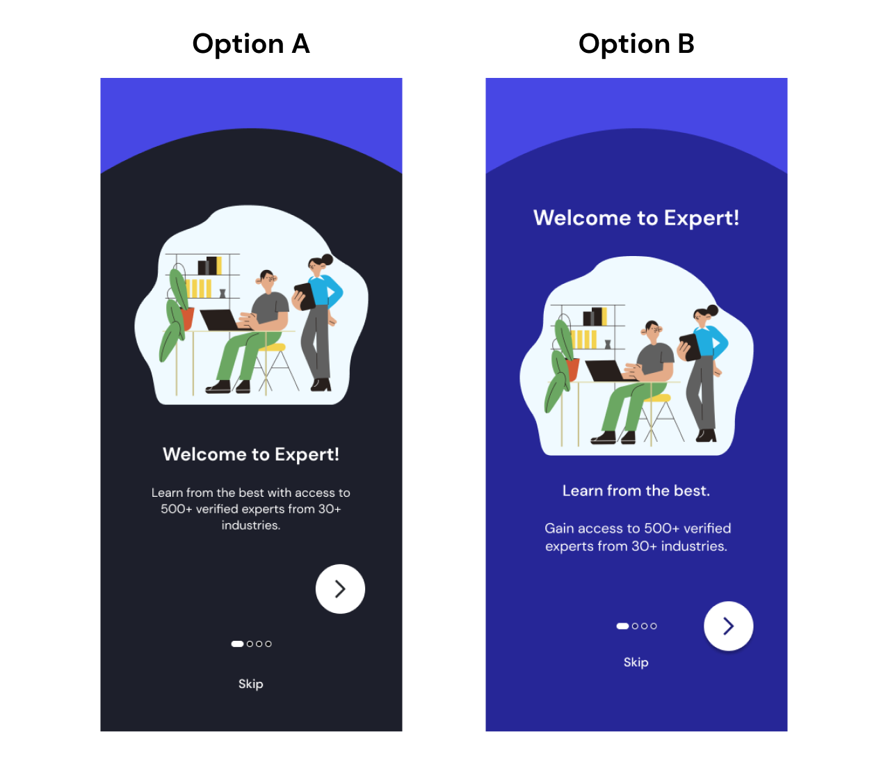
100% of respondents favored option B and mentioned they preferred the upbeat colors and the format of the text. They also found option B more eye-catching and easier to read.
As a result of this data, I incorporated the design style of option B into the rest of my onboarding screens.
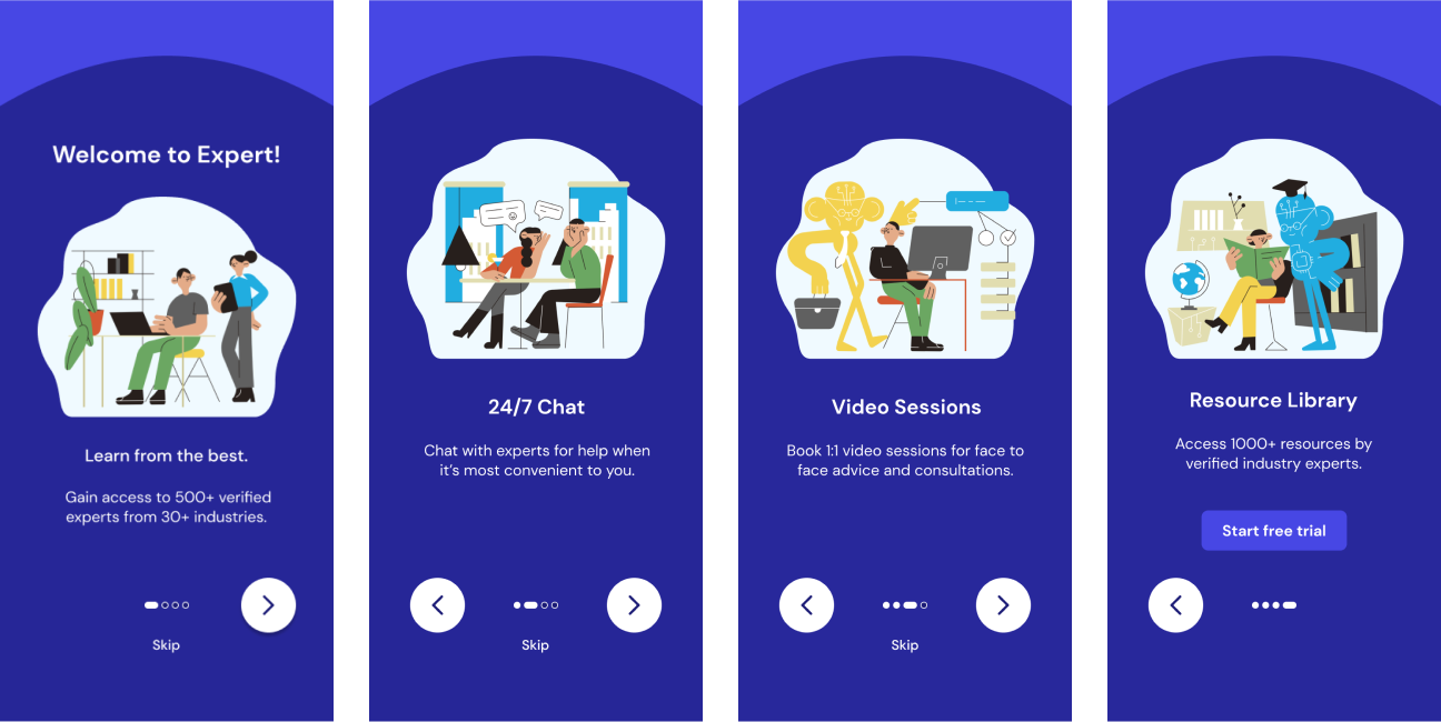
UI Design
As I continued to design Expert's high fidelity prototypes, I developed a Design Language System to streamline all UI design decisions.

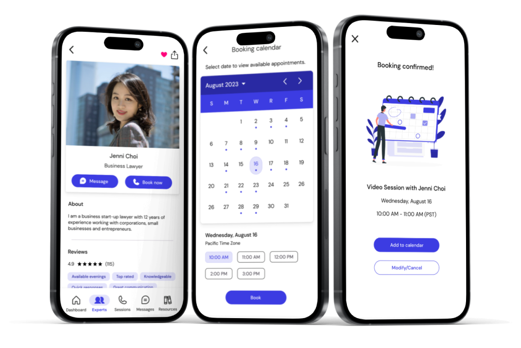
Final Prototype
Utilizing the user feedback received during testing and Expert's newly defined Design Language System, I implemented usability, accessibility, and visual updates to create a final prototype.


