Perfect Properties provides cohesive and comprehensive property information to reduce barriers for everyday people looking to invest in the real estate market.
Problem
New real estate investors struggle to get started without professional guidance and often focus on properties outside of their scope.
Solution
Design a responsive web application providing buyers with access straight forward and reliable information about potential properties
Role
UI Designer
Duration
2 months
Tools
Figma, FigJam, Miro
Design Process
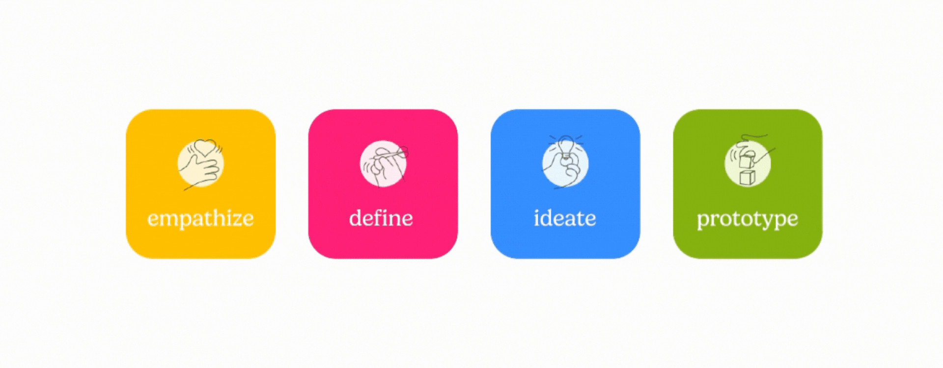
Empathize
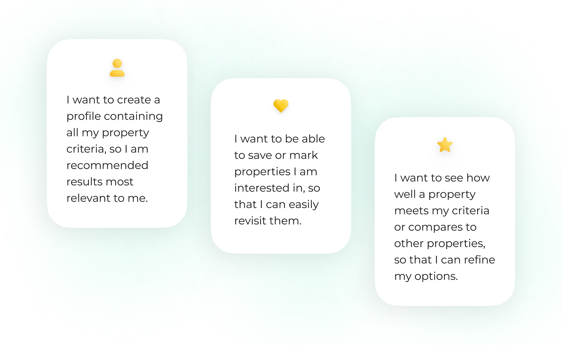
User stories
Since this project was the main focus of my UI for UX Designers Specialization course with CareerFoundry, Perfect Properties' user personas, and their user stories were provided to me. After reading through the case study brief, I decided to focus on the three user stories based on the following user needs:
- Search for properties, inputting criteria relevant to user needs
- Easily view and return to listings interested in
- Receive relevant and comprehensive information about properties
Define
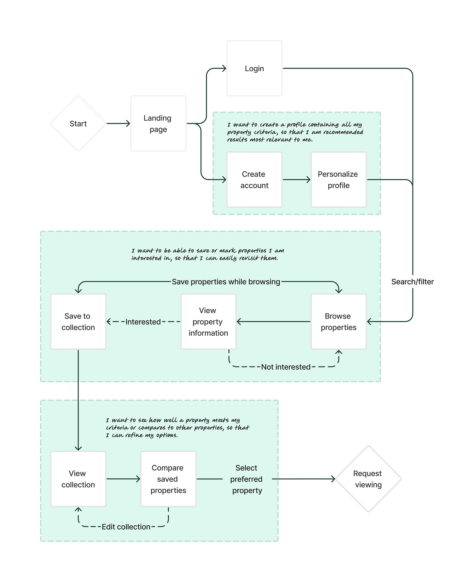
User Flows
Utilizing the user stories as a framework, I built out user flows to conceptualize how users will interact with the product to complete key tasks.
Ideate
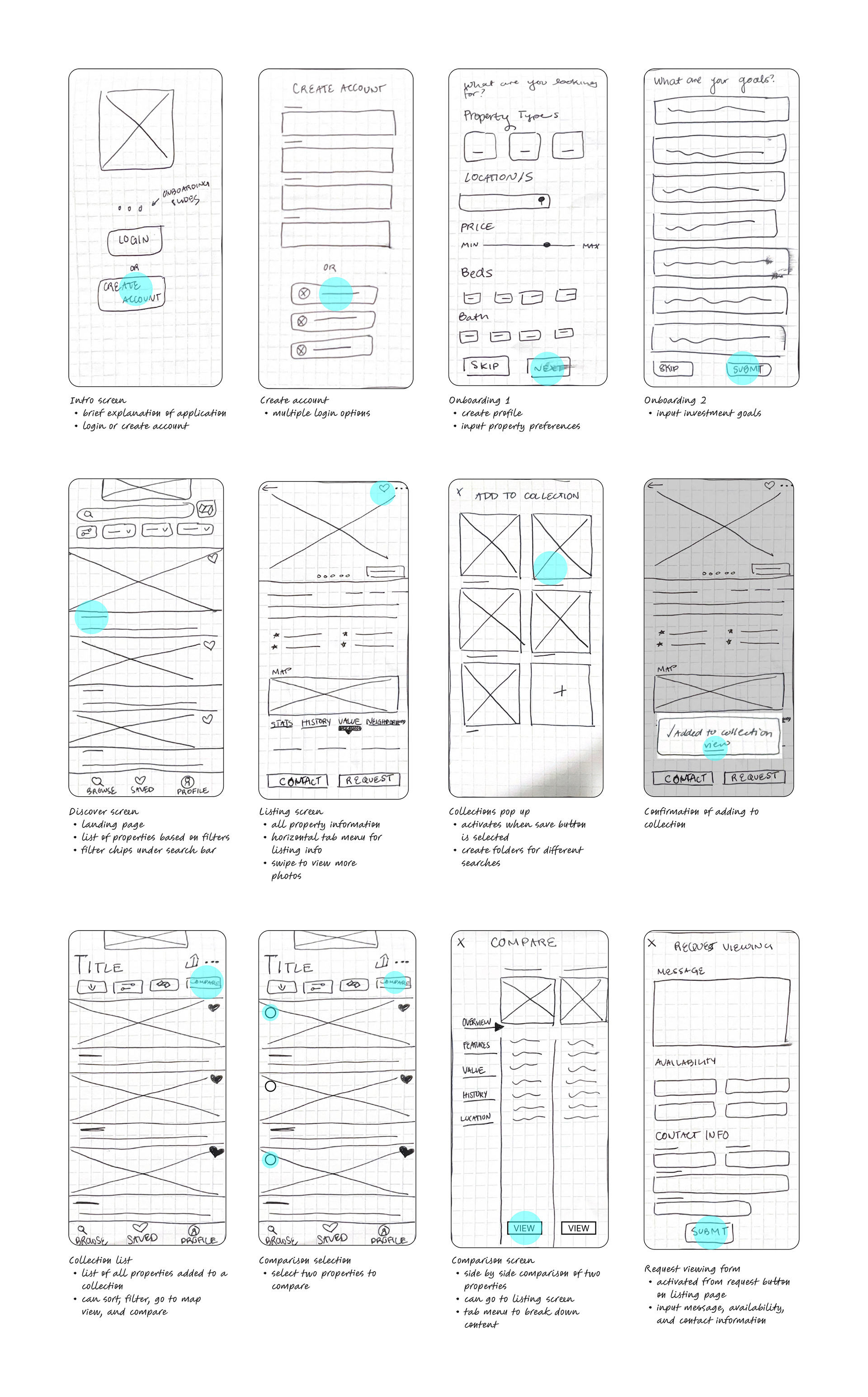
Low Fidelity Sketches
To kick off the ideation of my design process, I produced various rough sketches of the product using rapid prototyping techniques. I created a paper prototype using the sketches most effective in addressing user needs based on the previously defined deliverables.
Design Iterations
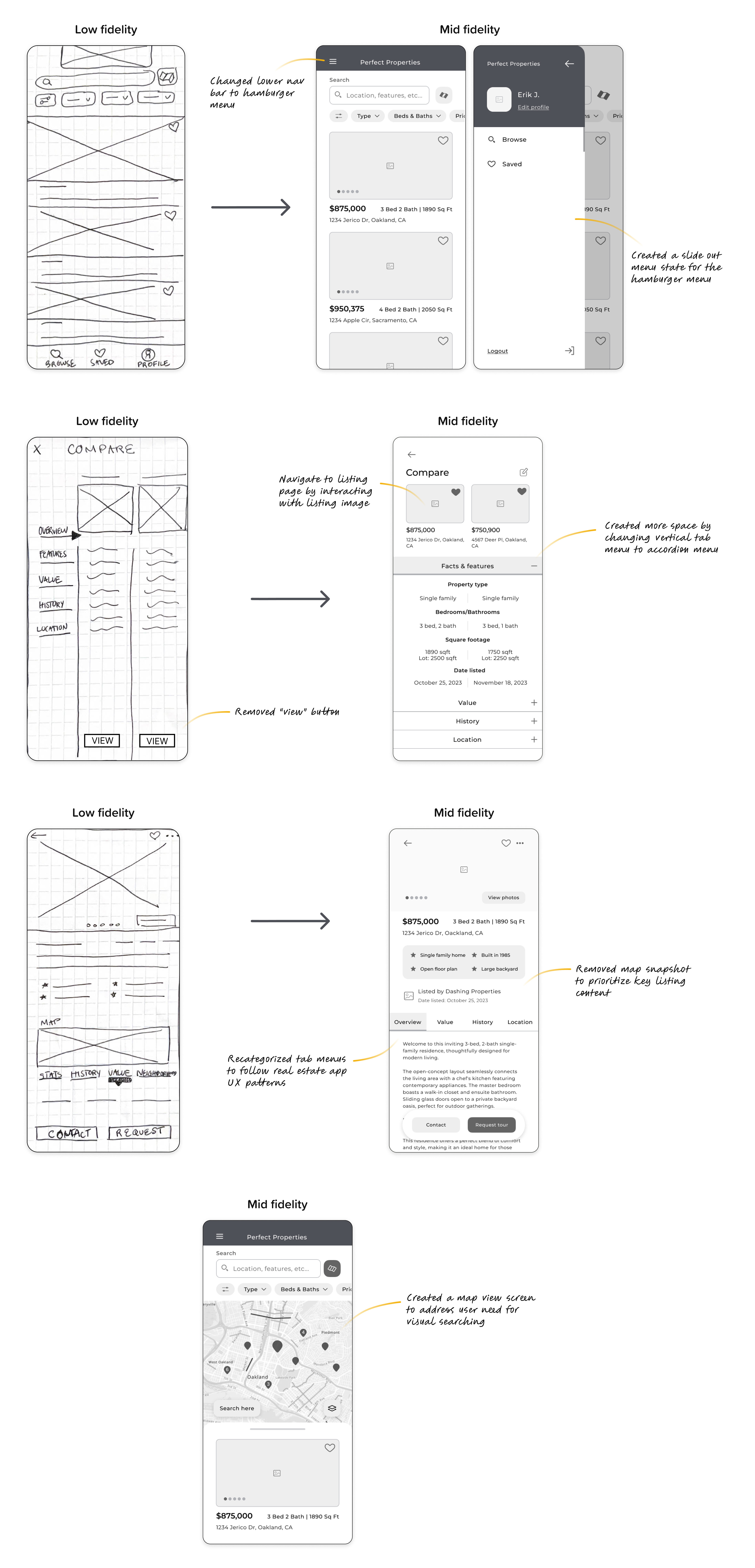
I continued to iterate and implement UI design patterns as I developed my low fidelity sketches into digital mid fidelity wireframes. My designs started to come to life, creating space to begin brainstorming the product's visual UI design.
UI Implementation
Mood Board
To create a clear visual direction for Perfect Properties, I created multiple mood boards and selected the one that aligned best with the product's defined user needs. Given the need for a property finder that is simple, straightforward, and trustworthy, I selected the mood board that leaned into clean and natural color, typography, and imagery.

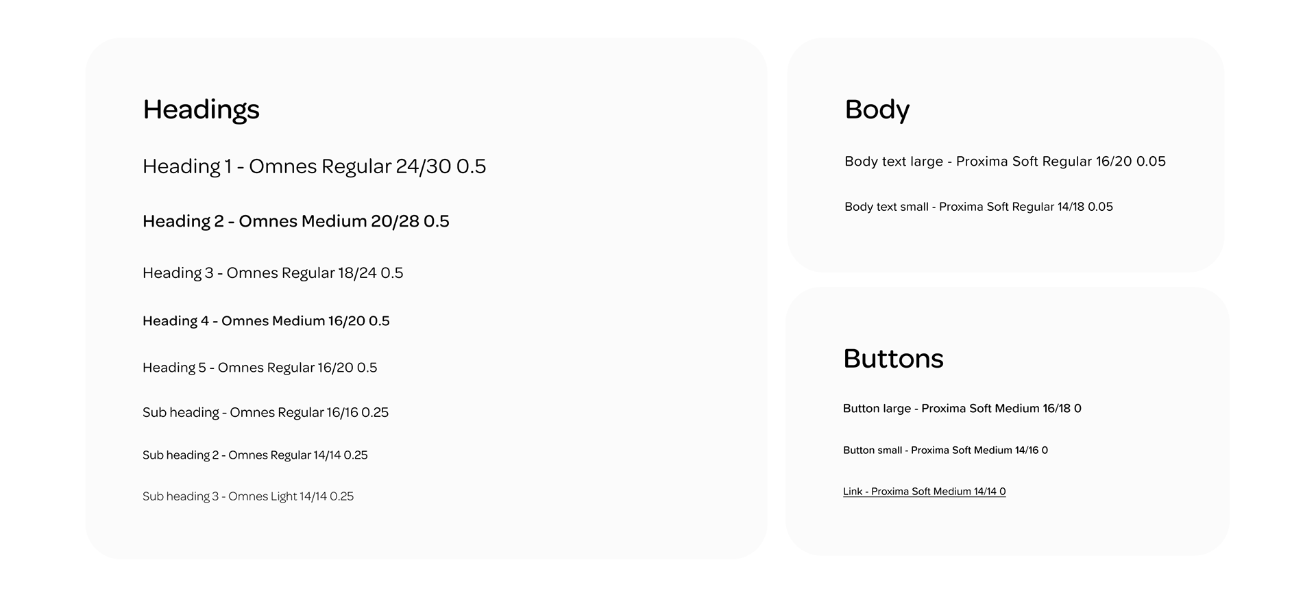
Typography
To maintain the clean visual direction, I selected Sans Serif typefaces for all text styles.
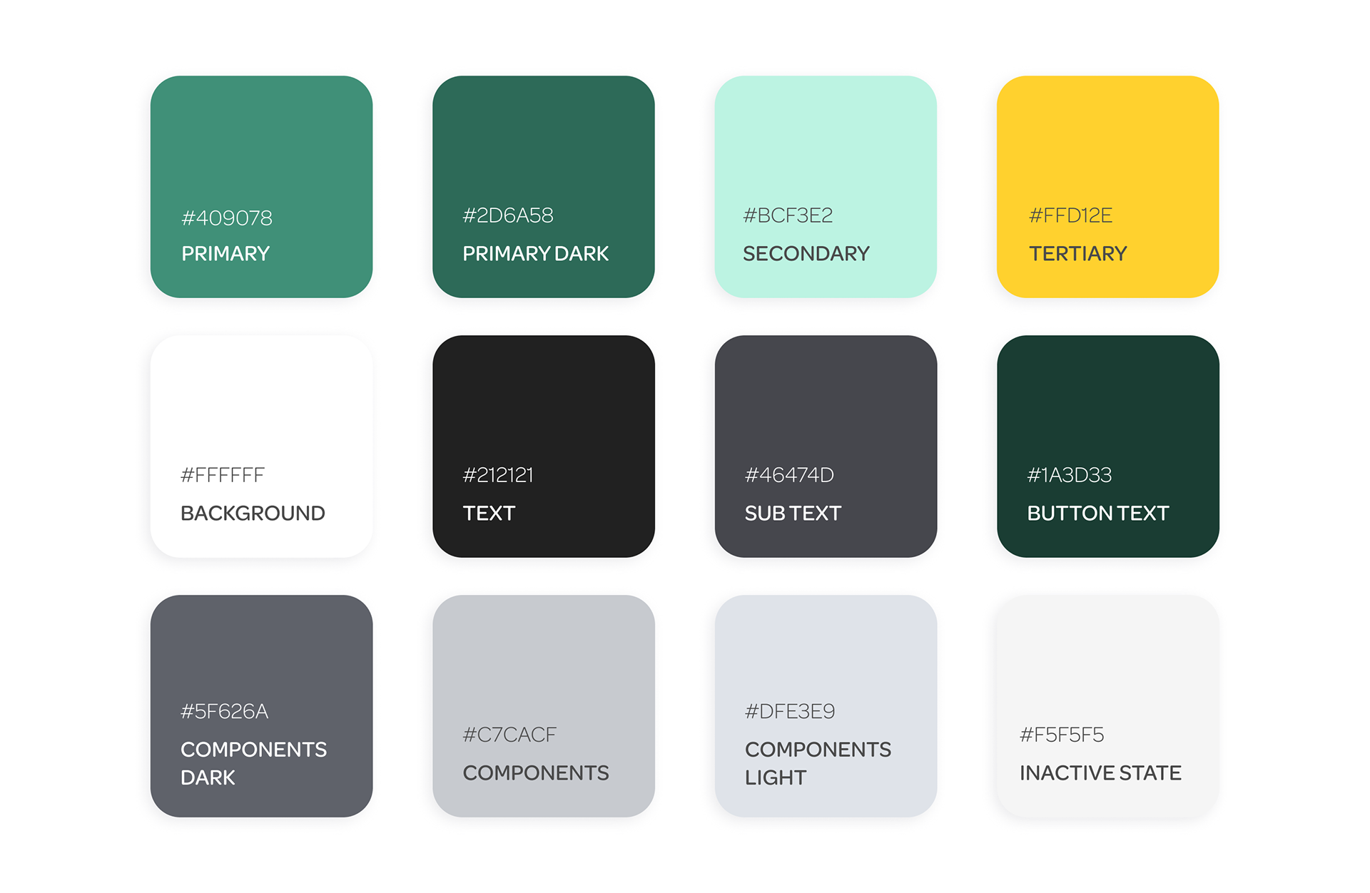
Color
The final color palette meets WCAG's AA accessibility standards while following the organic and clean product mood. To achieve this, I implemented the use of natural greens and yellows, as well as whitespace.
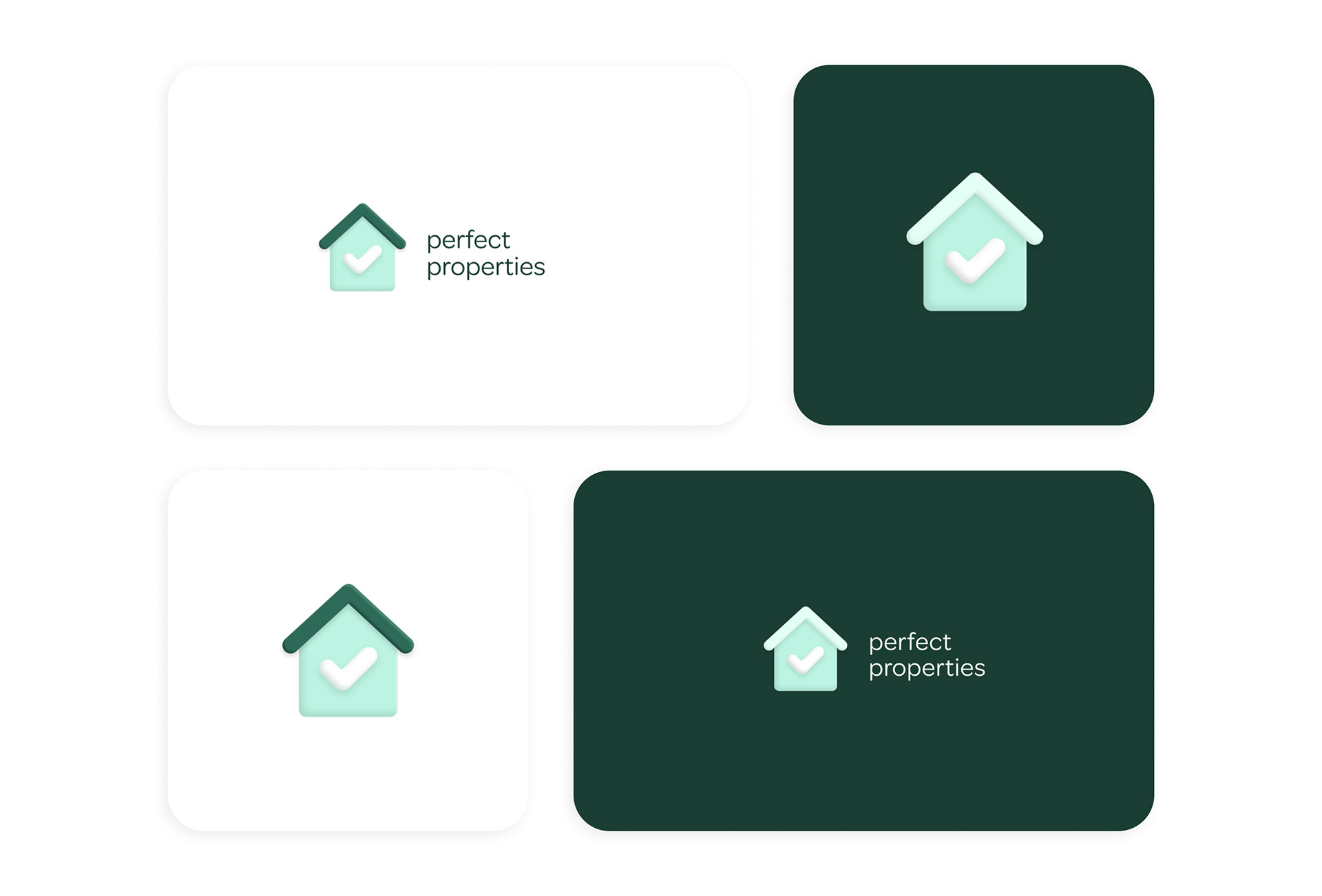
Logo
I designed Perfect Properties' logo to feel simple and kindred to the product's purpose of discovering properties that align with users' investment goals.
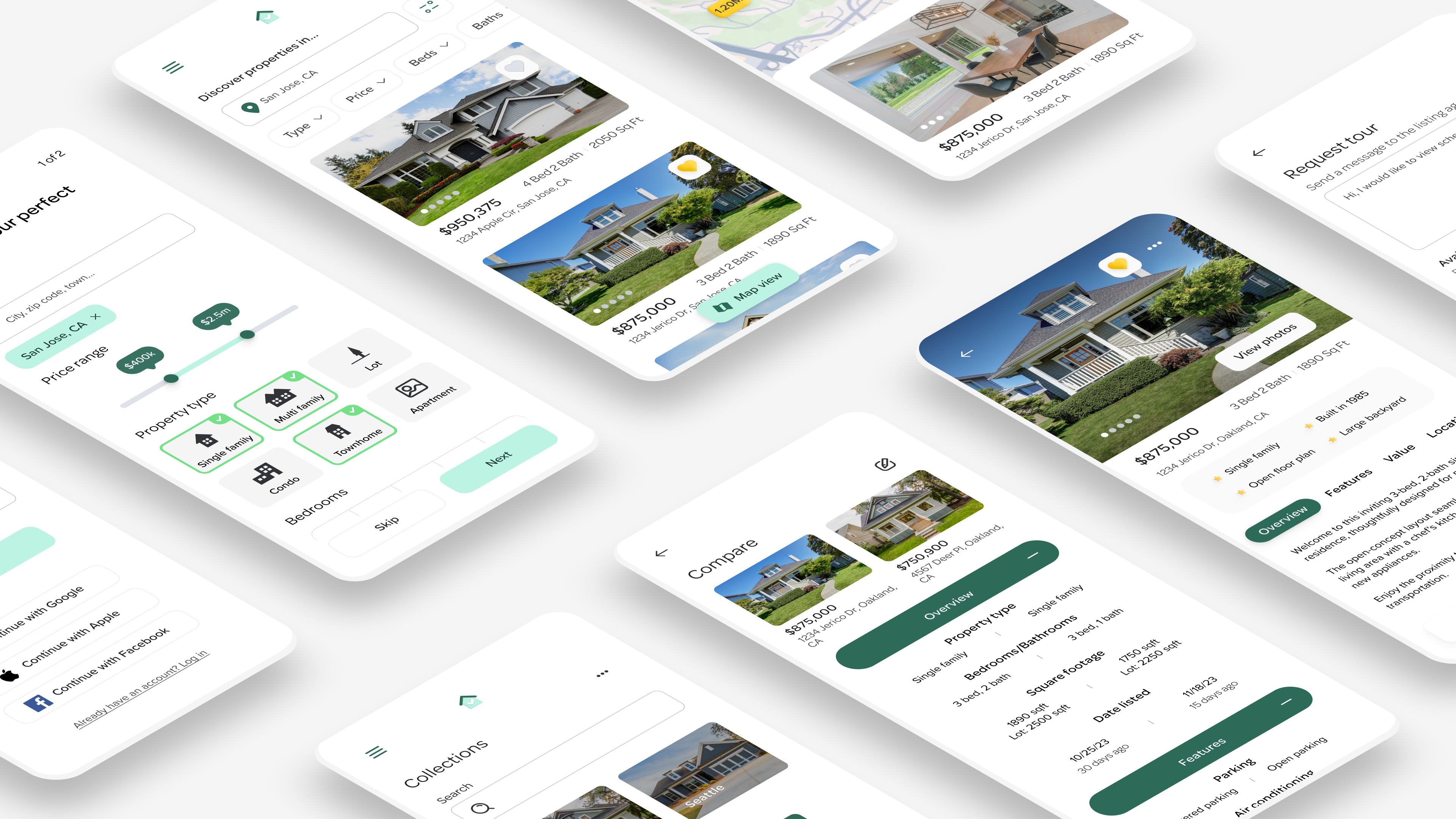
Prototype
Designing Interactions
Moving into the prototyping stage of my design process, I implemented micro-interactions and motion UI to enhance the user experience.
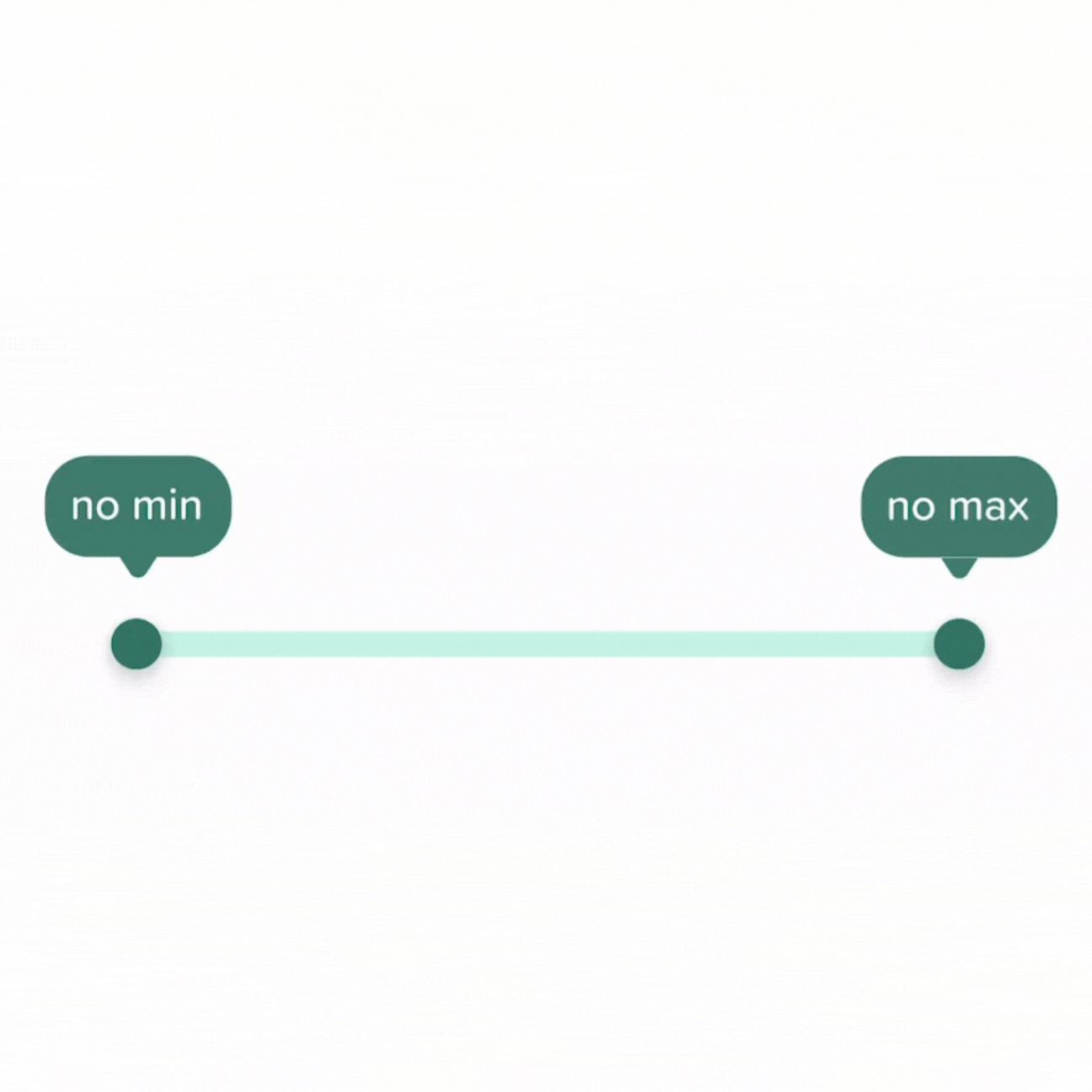
Set minimum and maximum price filter

Save listings
Hamburger menu
Map view
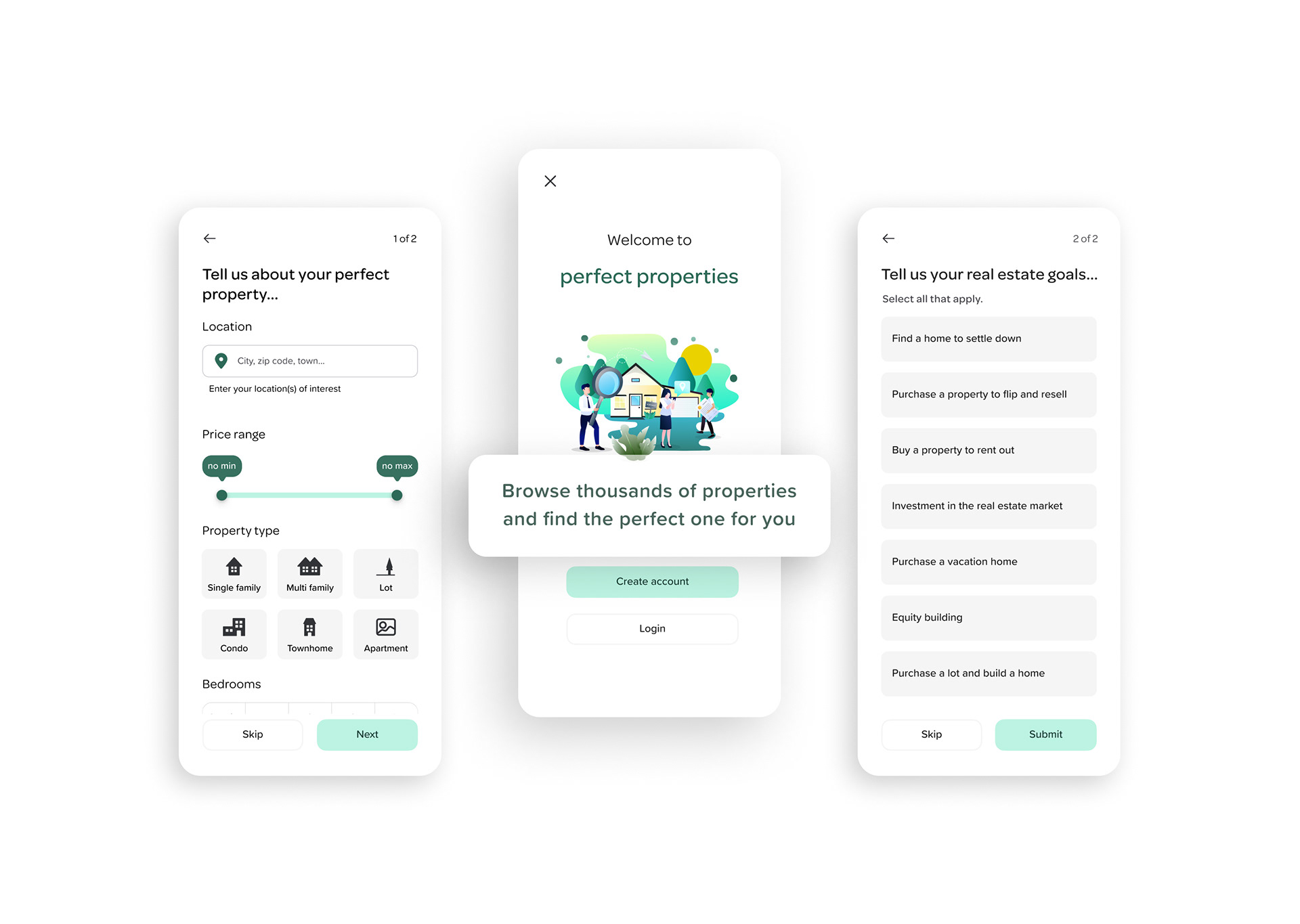
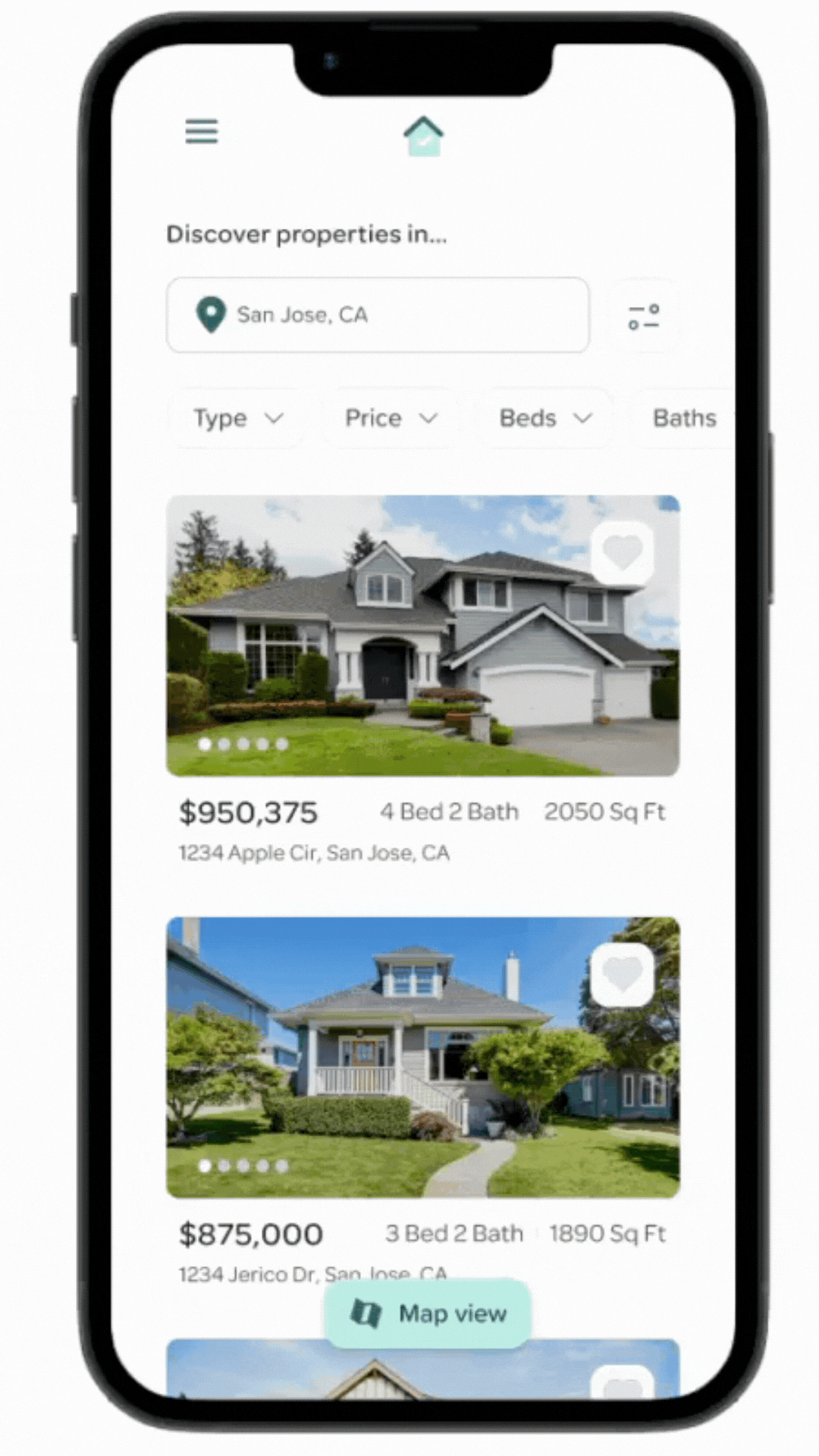
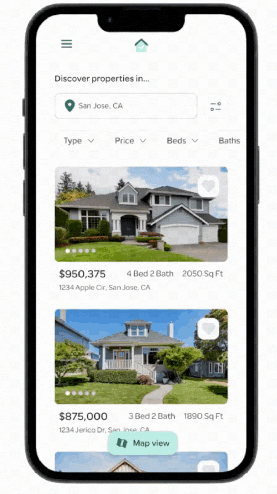
Final Mobile Prototype
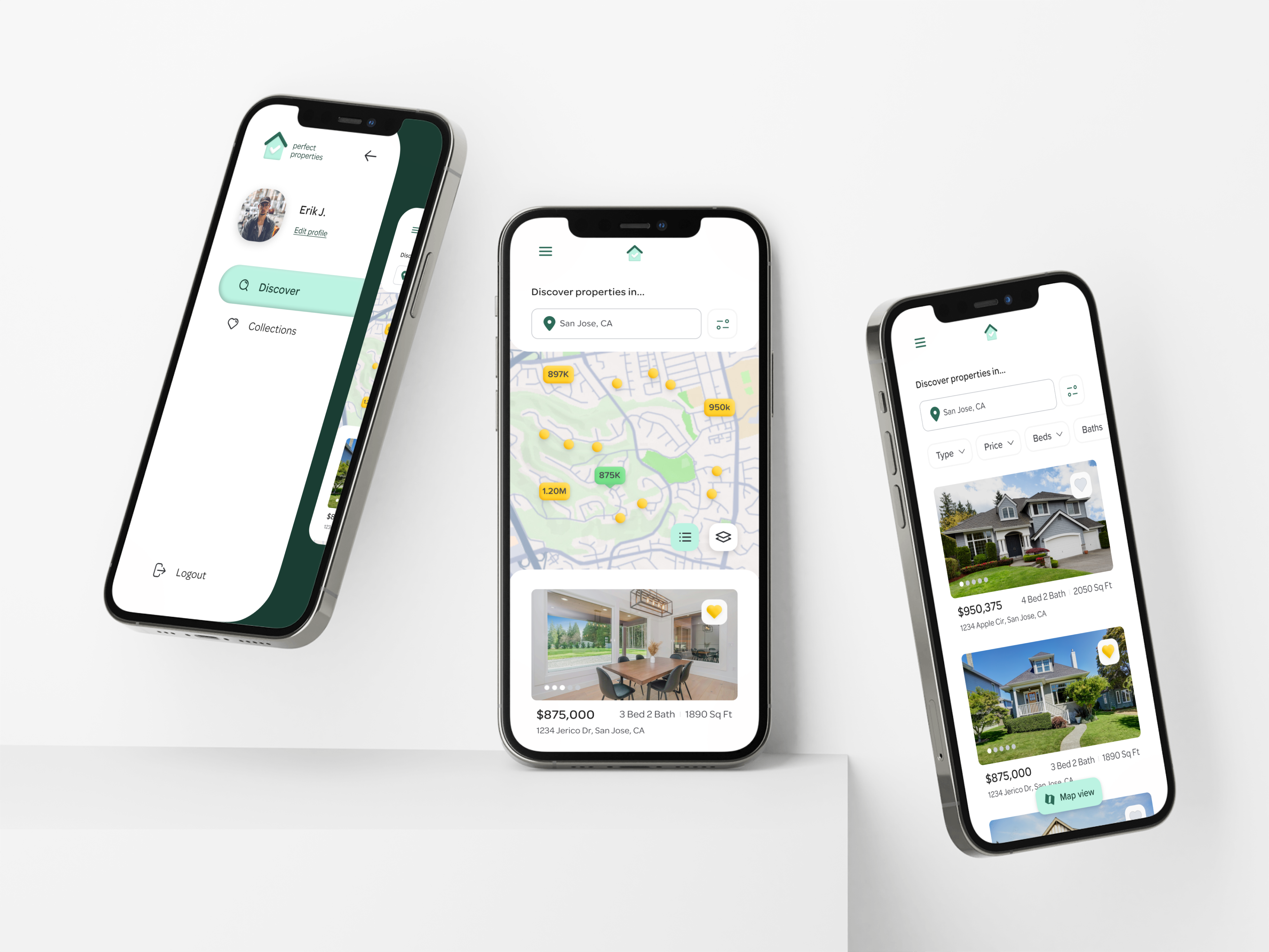
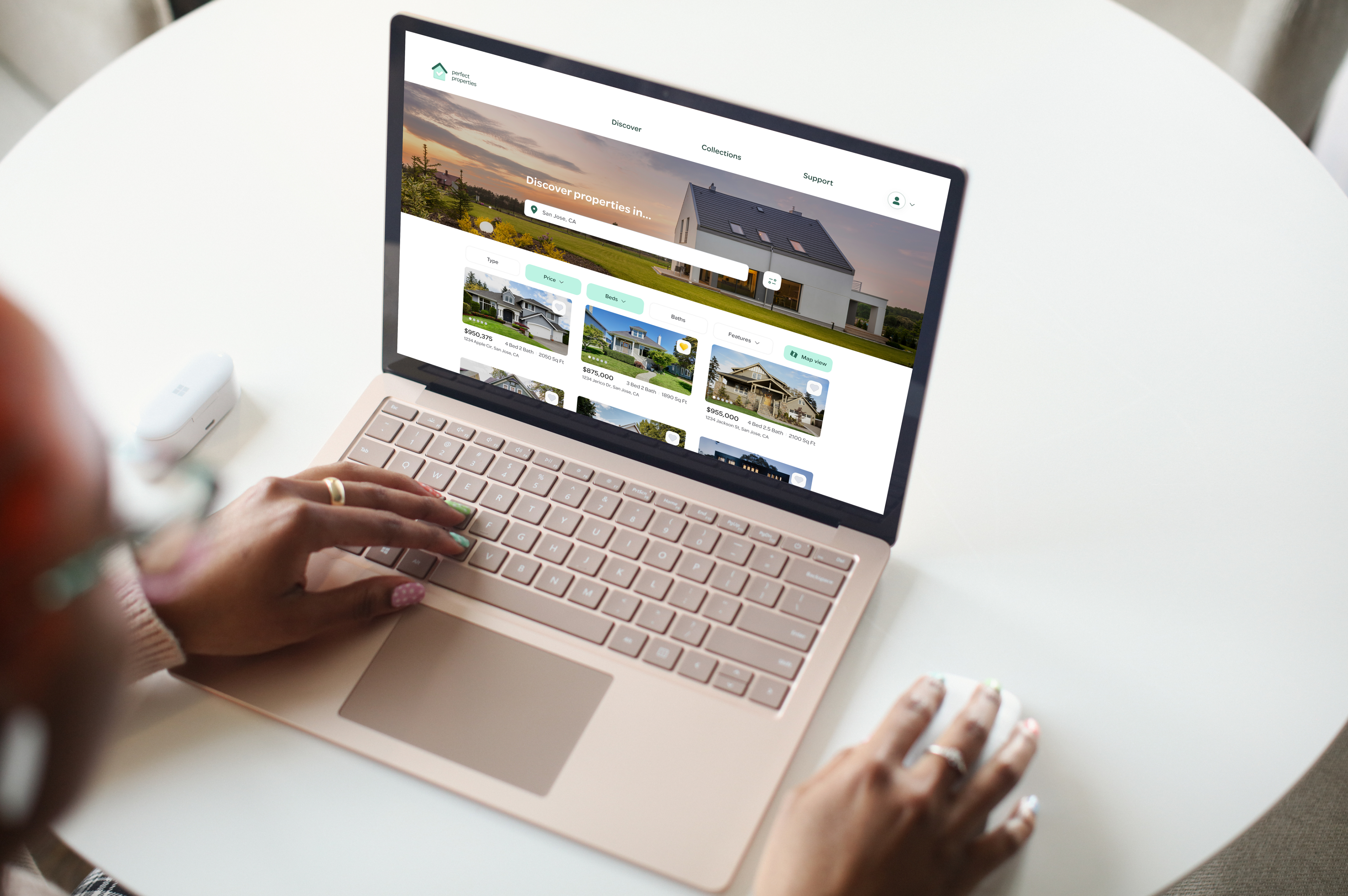
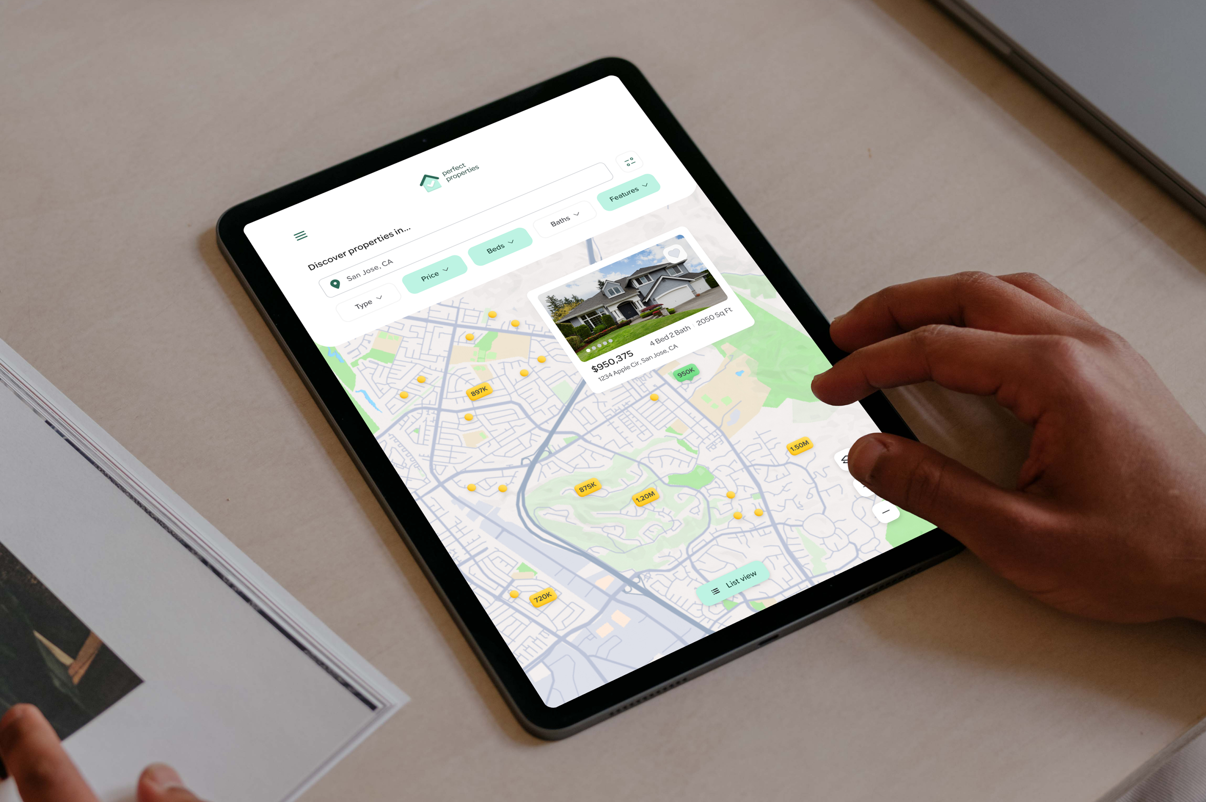
Responsive Design
I designed Perfect Properties to be a mobile-first responsive web application by designing with mobile users in mind first and foremost. Then using the UI elements already created, I formatted all content for tablet and desktop breakpoints.

Lessons Learned
Stay organized...
Keeping up with your Figma file organization as you go will make handoff easier and smoother!
UI isn't everything...
UI without UX is like a body without a brain. Your wireframes can be stunning and adventurous, but the effort only matters if the product can meet your user's needs!
Future Iterations
1. Finish building out any missing screens from the mobile prototype
2. Complete responsive design and design all mobile screens for tablet and desktop breakpoints
3. Add more micro-interactions and haptic feedback for improved user engagement