Room to Read is a global non-profit organization partnering with local communities to improve literacy in underfunded communities and gender equality in education.
Project Overview
Problem
Room to Read's current homepage lacks a focus on fundraising efforts and presents accessibility issues.
Solution
- Assess Room to Read's current website for accessibility
- Redesign the homepage to increase donation and improve pinpointed accessibility issues
Role
UX Designer (User research and user personas pre-developed)
Tools
Figma, Adobe XD, Miro
Design Process

Empathize & Define
Accessibility Analysis
Before ideating, I analyzed Room to Read's current website for key accessibility issues that need to be solved to meet level A accessibility compliance according to WCAG and provided proposed solutions.
Key Issue:
Low-contrast text makes it difficult or impossible for many users to read in multiple areas throughout the website
Solution:
Add a dark overlay to images with text on them and change colors to increase contrast ratio
Key Issue:
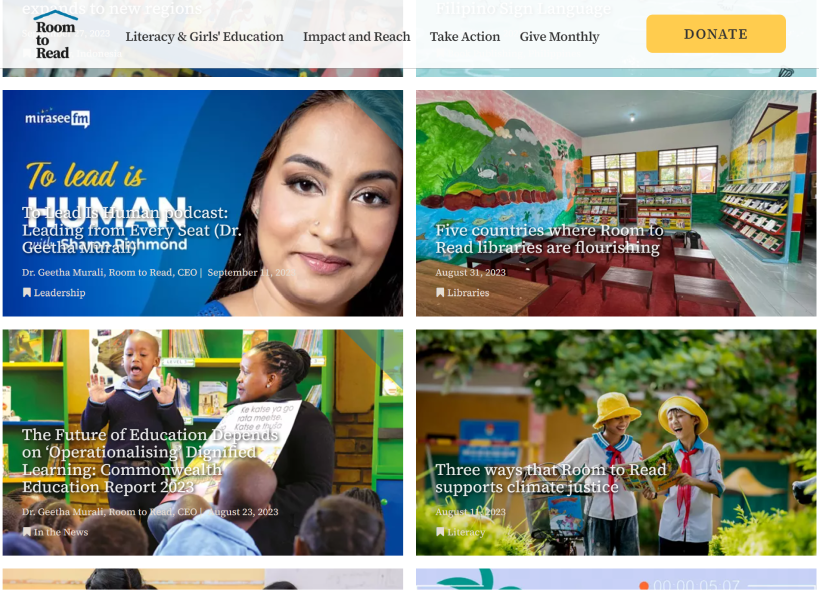
Certain links do not use descriptive texts that are accessible for screen readers like “Read more” and “Learn more”
Solution:
Remove these links and use article titles and cards as links
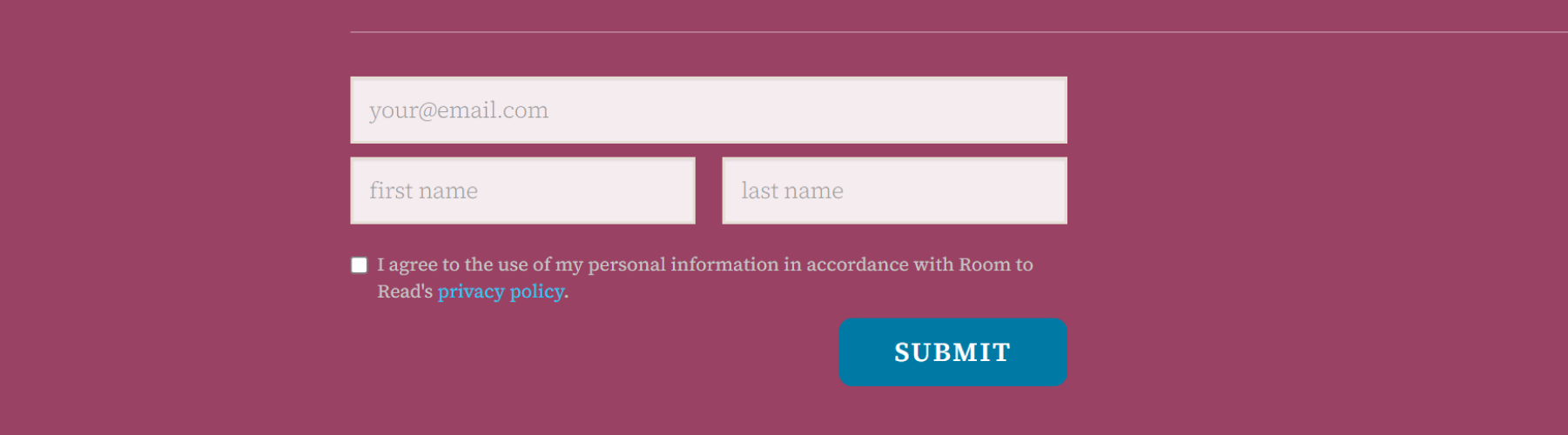
Key Issue:
Form labels are placeholders and do not remain visible when the field is active
Solution:
Add form labels that remain even when form fields are selected
Ideate
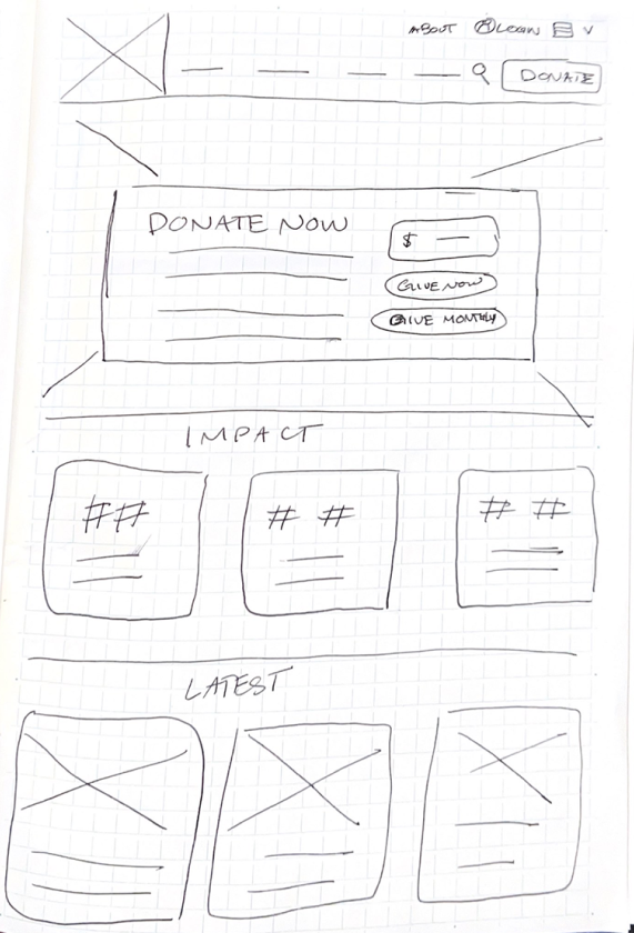
Low Fidelity Sketches
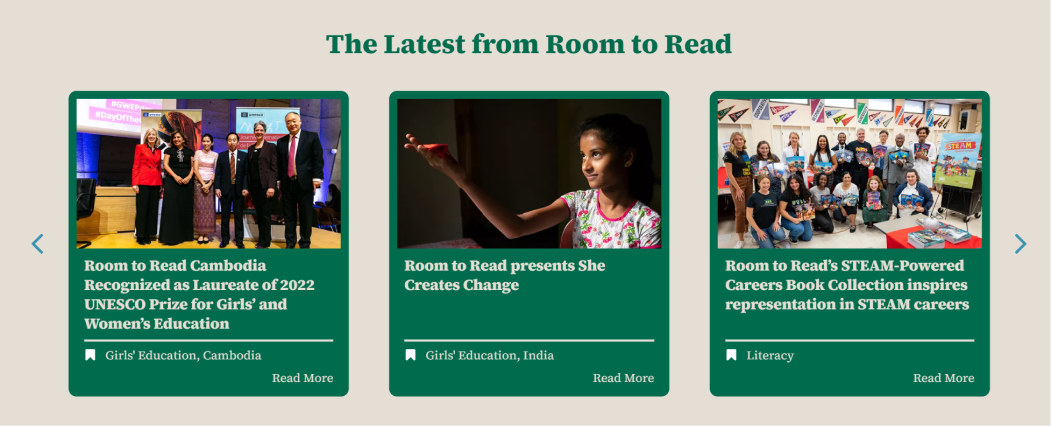
After analyzing Room to Read's website for present accessibility issues, I sketched out the below wireframes for possible solutions. To create these, I also considered pre-existing user research that provided the insight that Room to Read’s typical donor would like a simple way to donate regularly and the ability to see the impact of their donations.

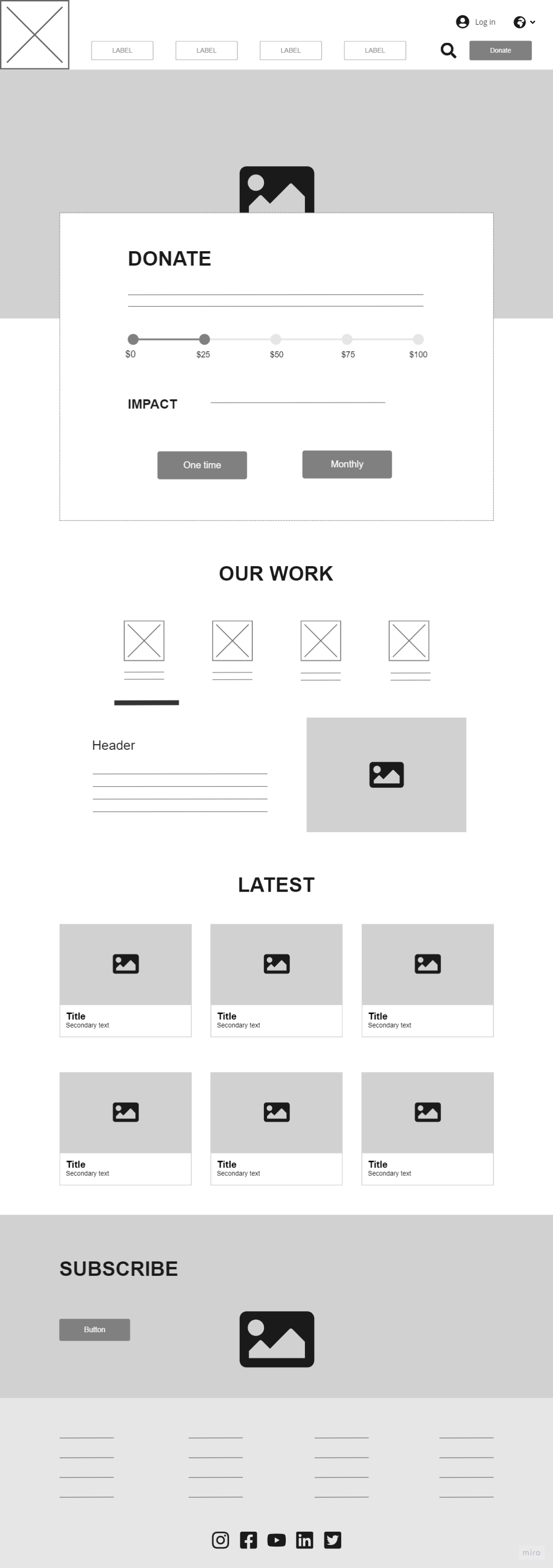
Mid-fidelity Wireframe
When transferring my ideas into a mid-fidelity wireframe, I decided to go with my second low-fi sketch. The intention was to integrate an interactive donation bar that would explain what each donation amount could provide for a Room to Read student.
Prototype
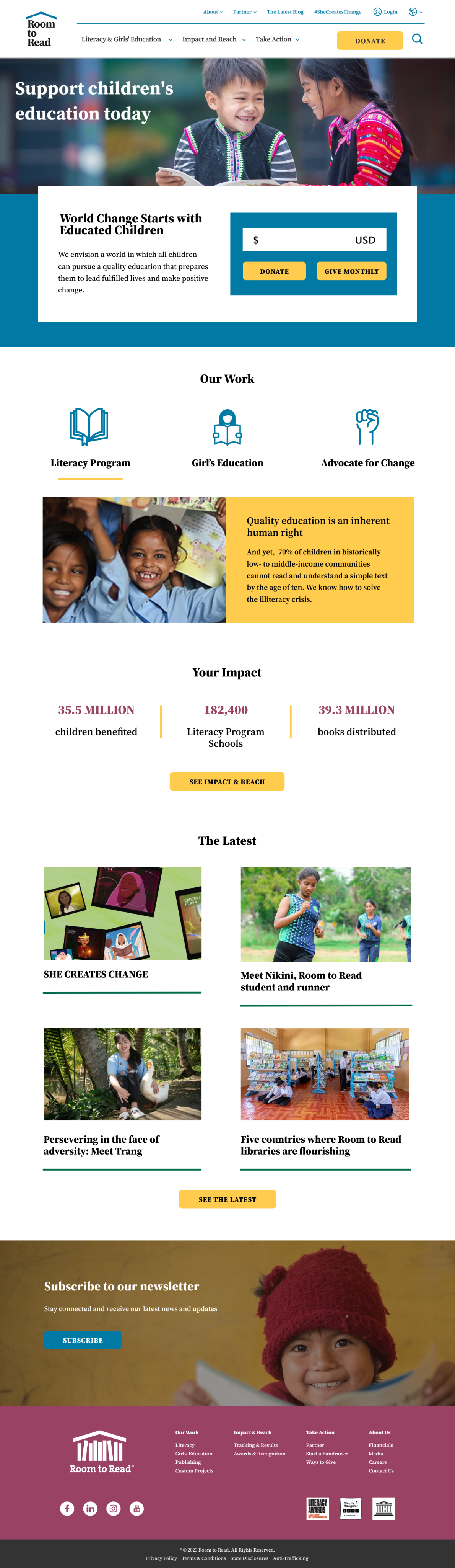
Final Proposal
After I began designing my high-fidelity wireframe, I struggled to make the donation bar work. I began to think it may hinder usability despite the intention to make the users goals easier to achieve. I decided to incorporate the minimized donation form field as designed in my first low-fi sketch.
In my final proposed redesign, I incorporated my proposed accessibility solutions as well as new features to increase user donations:
1. Login feature to encourage recurring donors
2. Minimal donation form on homepage
3. Key impact spotlights
4. Simplified newsletter subscription